Chapter Outline
- 1. Design Principles & MVP - Core UX principles for author-friendly design
- 2. Progressive Disclosure - Start simple, add details when needed
- 3. Visual Feedback - Real-time progress and status indicators
- 4. Credit Transparency - Clear pricing and usage visibility
- 5. Mobile-First Design - Responsive design for all devices
- 6. Role-based UI - Tailored interfaces for collaborative production teams
1. Design Principles & Minimal Viable Product
Understanding that our users are authors spanning ages 30 to 65+, I knew the user experience had to be universally accessible. I developed a design philosophy centered on three core principles that guide every interface decision:
- Break complex processes into simpler steps - No overwhelming interfaces
- Feedback is key - Users always know they're on the right track
- Be transparent about credit usage - No surprise charges or hidden costs
These principles aren't just theoretical. I apply them to every feature, ensuring AudioFlo remains accessible to authors regardless of their technical expertise. Whether someone is tech-savvy or just learning to navigate digital tools, the interface should feel intuitive and supportive.
Minimal Viable Product (MVP)
Before implementing anything, I wrote down the minimal features required for producing an audiobook. I focused on the essentials that would deliver real value without overwhelming users:
- Simple Upload Flow - A straightforward way to upload manuscripts, choose voices, and create audiobooks
- Voice Cloning Technology - Custom voice creation since many authors want to narrate with their own voices
- Conversion Dashboard - Real-time status tracking for all conversion requests
- Credit Transparency - Clear visibility into remaining credits and usage history
- Role-Based Access - Team collaboration features so authors with editors can work together seamlessly
2. Start Simple, Add Details Later
I believe in progressive disclosure as a core principle. The interface reveals complexity only when users are ready for it, preventing cognitive overload while maintaining powerful functionality. My approach prioritizes getting users to their first successful conversion quickly, then gradually introducing advanced features as they gain confidence.
Simple Upload Flow
I designed the upload flow to be as frictionless as possible. Authors simply drag and drop their manuscript (TXT or EPUB), select their audio output format, and choose a narrator. I deliberately kept these three steps separate and sequential because rushing users through multiple decisions at once leads to mistakes and regret. Each step has just enough information to make an informed choice without overwhelming details.
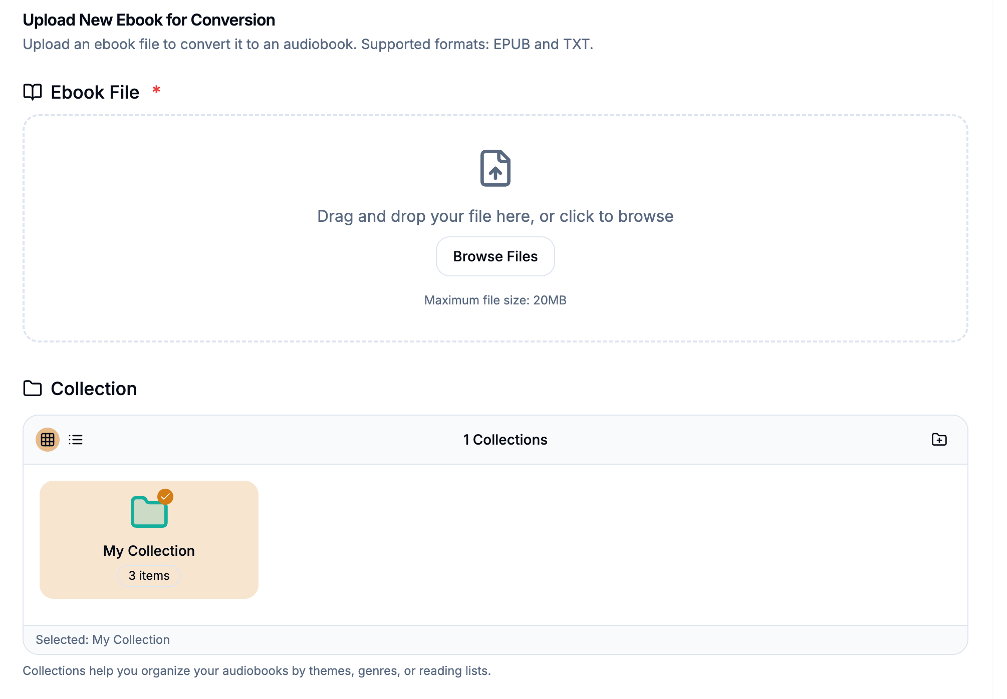
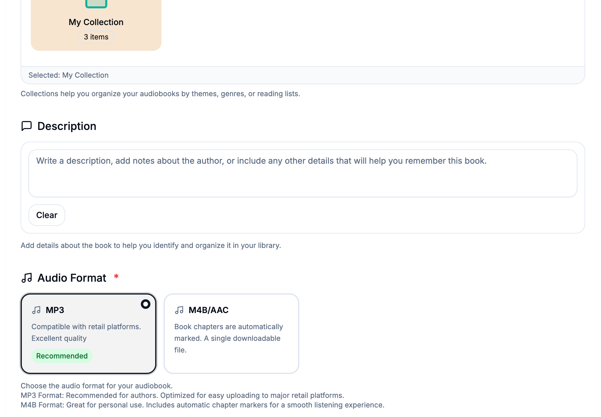
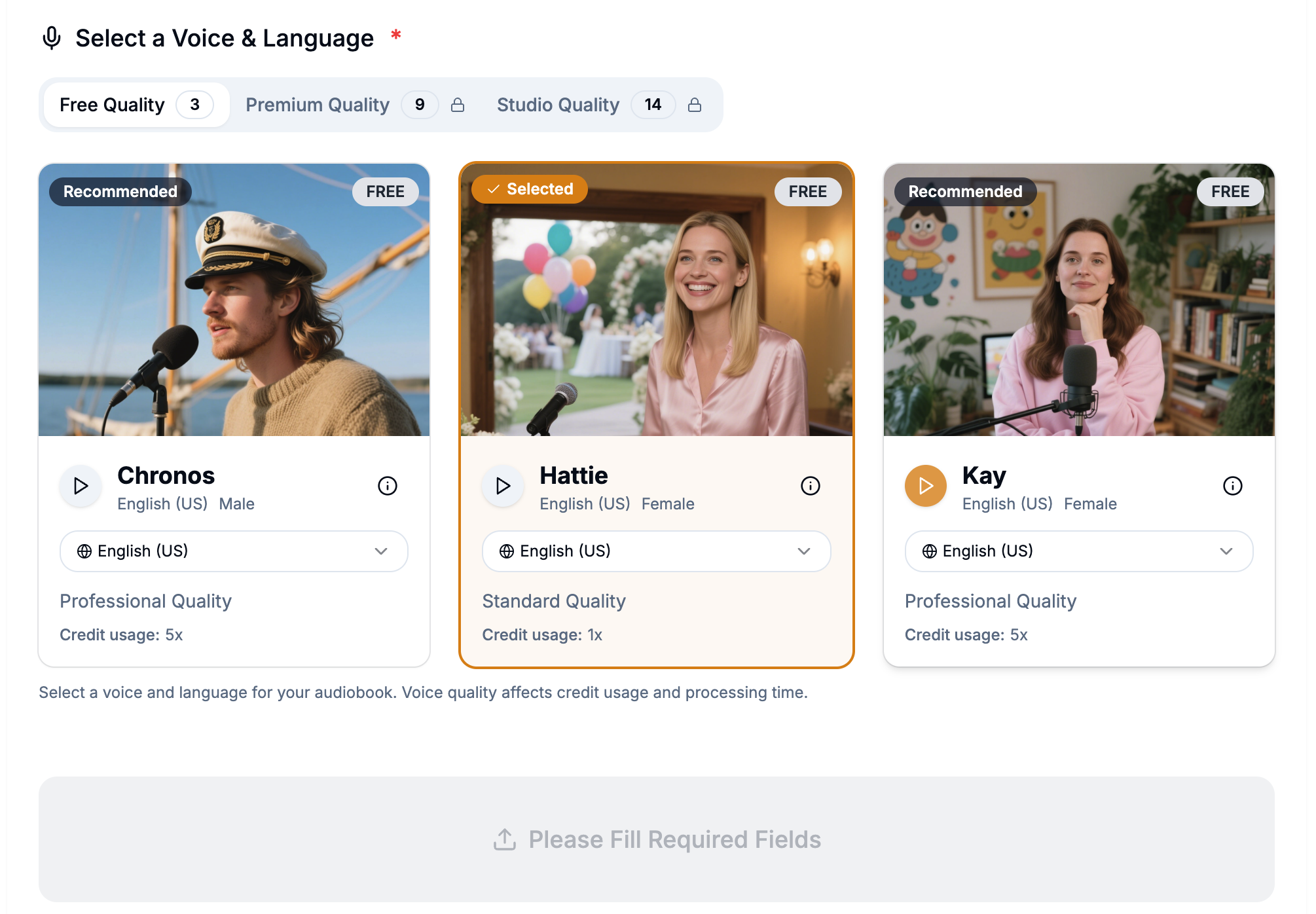
Figure 1: AudioFlo's streamlined three-step upload process for audiobook creation
Hover over an image to zoom in
Voice Cloning Wizard
The voice cloning feature balances simplicity with security. Users create their custom voice by providing a name and avatar, then reading from our script library. I implemented a verification system that randomly selects from over 100 pre-written scripts and matches the recorded audio against the original text. This approach ensures authenticity while keeping the process straightforward - users can record directly through their browser or phone, whichever feels more comfortable to them.
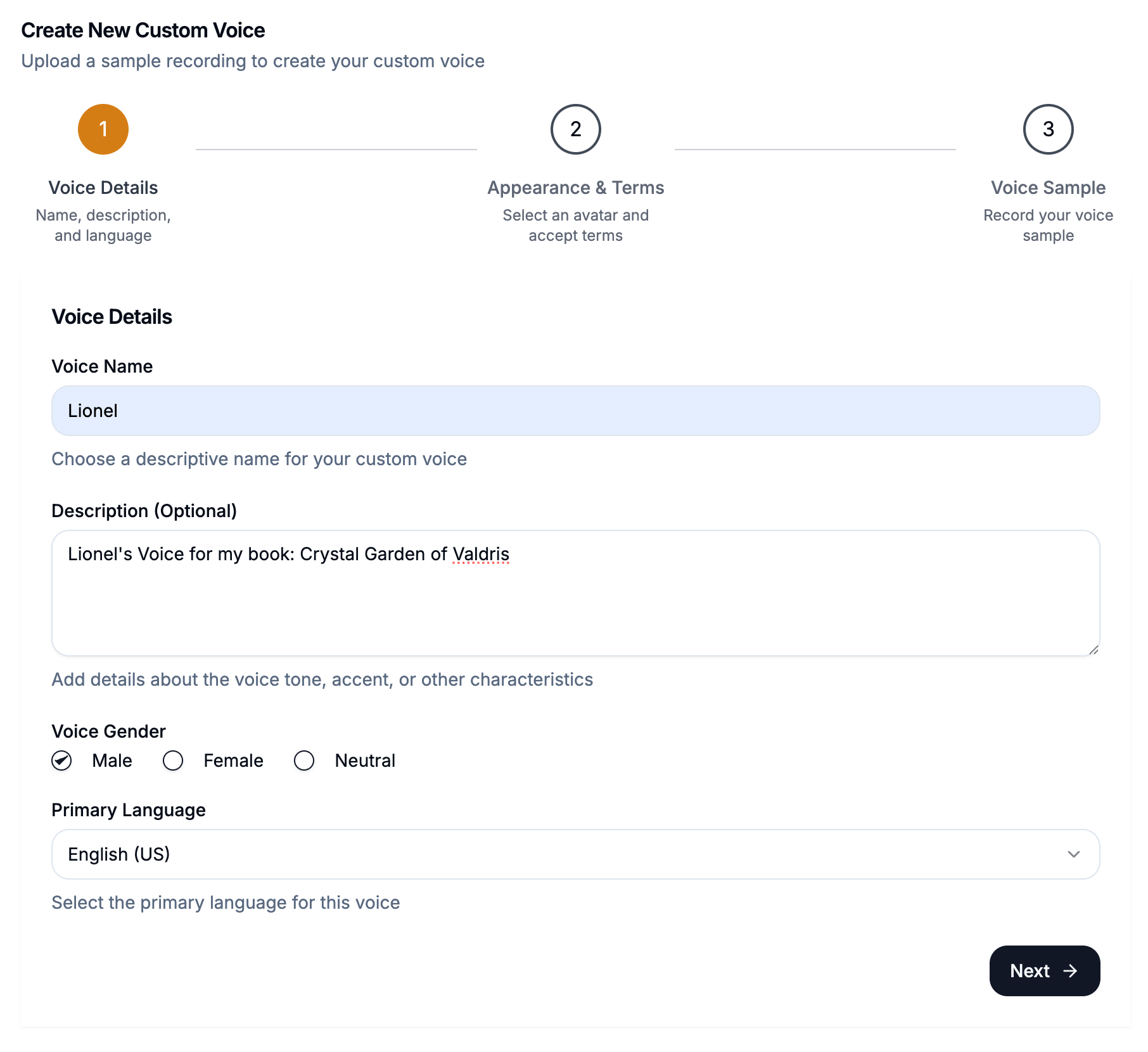
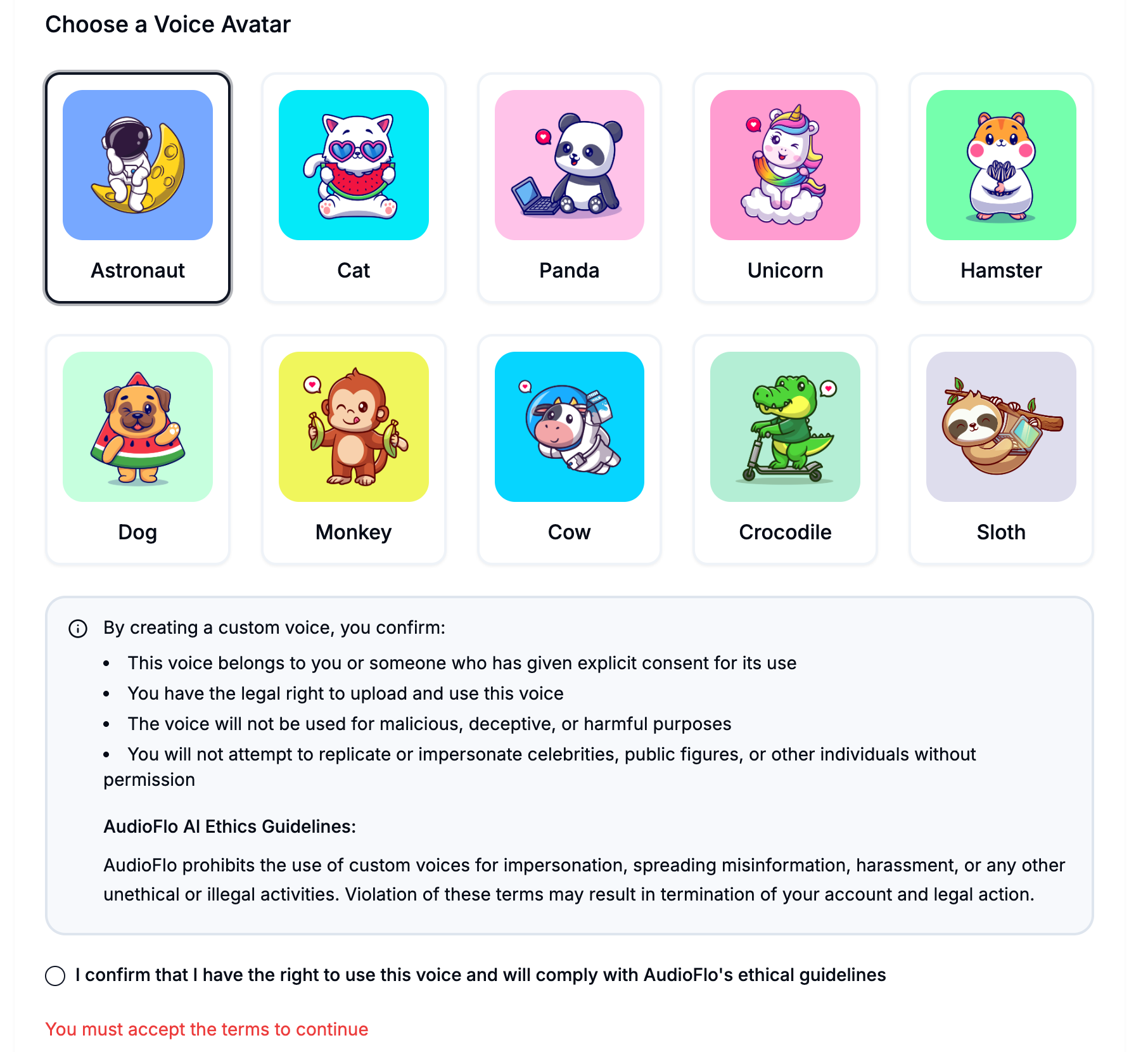
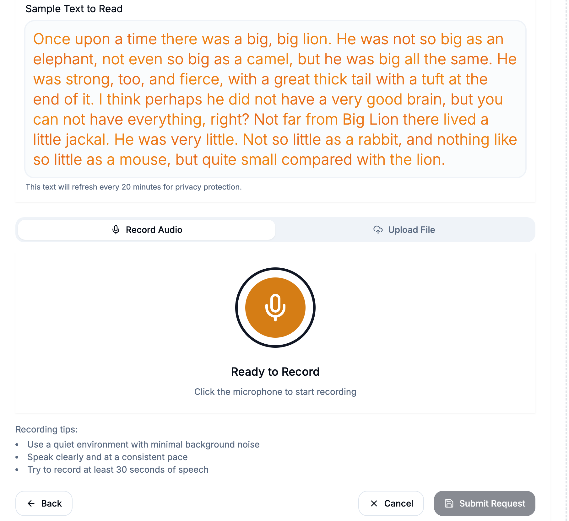
Figure 2: AudioFlo's streamlined three-step voice cloning
Hover over an image to zoom in
3. Visual Feedback Systems
I recognized that authors need constant reassurance during the conversion process. Waiting for an audiobook to generate can be anxiety-inducing, especially for first-time users. That's why I built comprehensive visual feedback systems with real-time updates and clear status indicators. Every action gets immediate acknowledgment, and users always know exactly what's happening with their project.
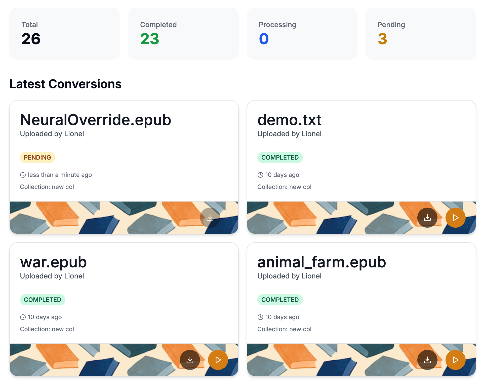
Conversion Request Summary
The conversion dashboard is designed to be a single source of truth for all ongoing projects. Users can see at a glance which books are processing, completed, or need attention. The status indicators use familiar patterns - yellow for pending, blue for active conversions, green for completed ones, and red when something needs fixing. This centralized view reduces anxiety and gives authors full control over their production pipeline.
Multi-Channel Notifications
- In-app toast notifications for immediate feedback
- Email notifications when conversion requests are submitted, or completed
Every operation receives instant feedback, ensuring users always know their actions are having an effect. This multi-layered notification system eliminates the uncertainty that often frustrates users in audio processing platforms. Whether it's a successful upload, a completed conversion, or a system error, users receive clear, actionable feedback through their preferred channels.
4. Credit Transparency
Trust is the base of everything. Pricing transparency builds trust. Authors should never be surprised by credit charges or unclear about their remaining balance.
Account Overview
The account overview was designed to display critical information at a glance - remaining credits, current subscription plan, and usage statistics. Users should never have to hunt for their credit balance or wonder about their plan status. By placing this information prominently on the dashboard, I ensure users can make informed decisions about their next conversion without any surprises.
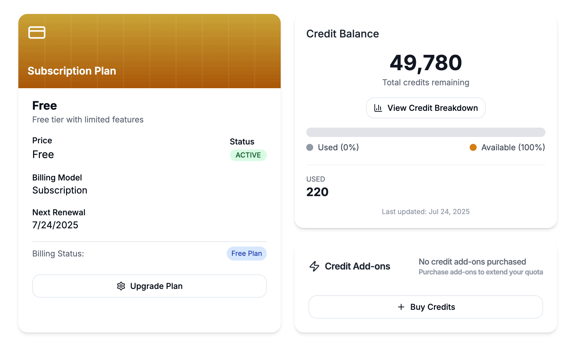
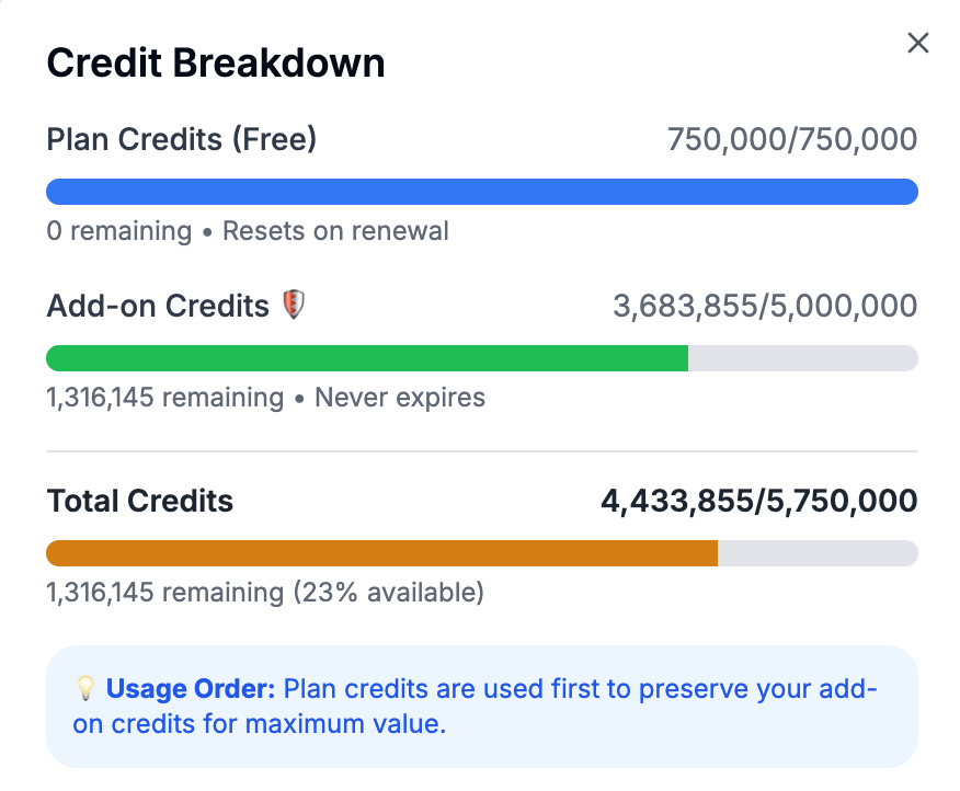
Credit Breakdown
Visual charts clearly differentiate between plan credits and add-on credits, helping users understand exactly how their money is being utilized. I designed the system to prioritize plan credits first, since these are auto-renew monthly. This approach maximizes value for customers by preserving their purchased add-on credits for when they truly need them. From a user perspective, this prevents the frustration of losing unused plan credits while accidentally burning through expensive add-ons.
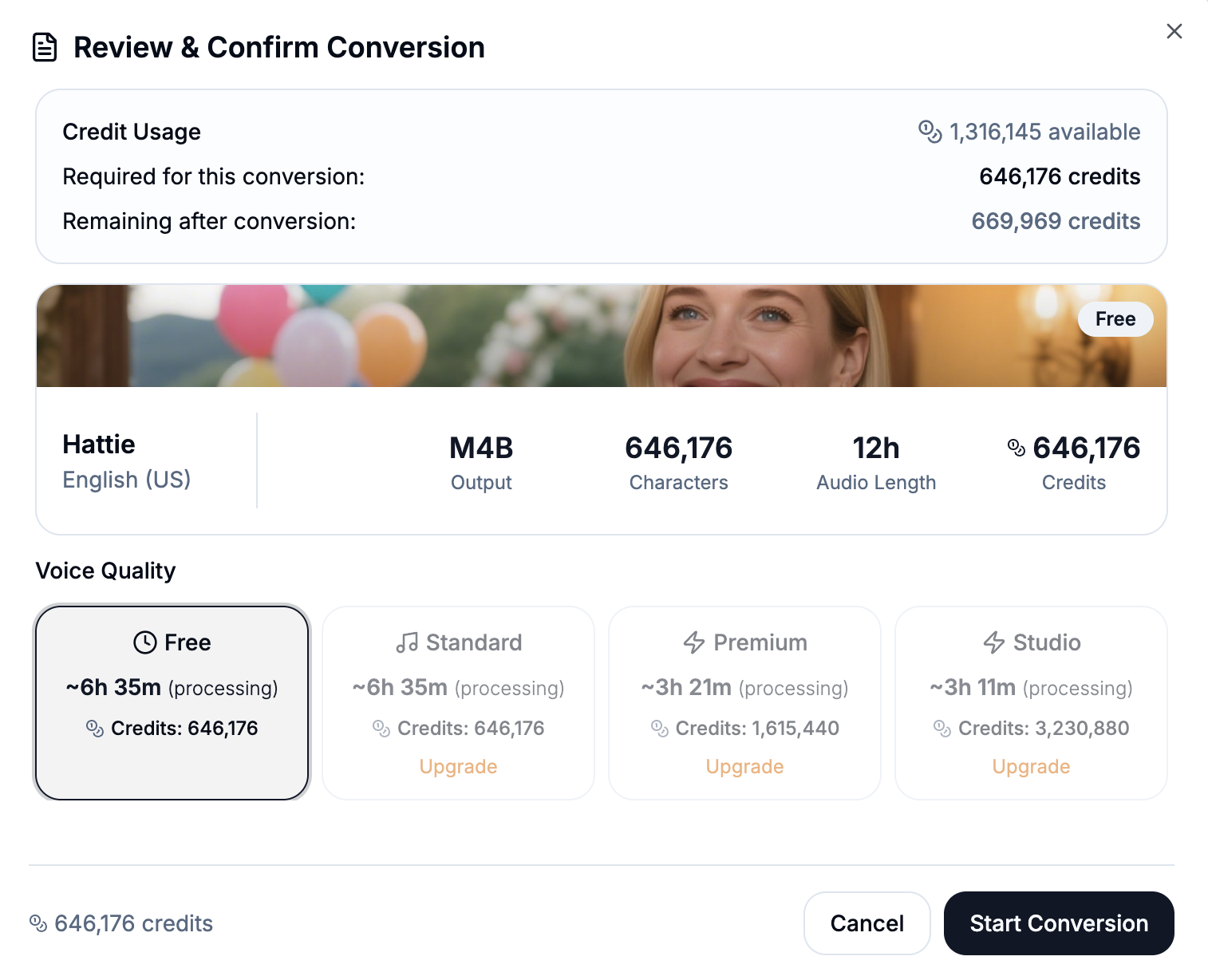
Credit Estimation
Comprehensive cost estimation ensures users never feel blindsided by charges. Before any conversion begins, the system shows both the estimated time and exact credit cost. This transparency ensures users can make confident decisions and builds trust by eliminating billing surprises, which is essential for long-term customer relationships.
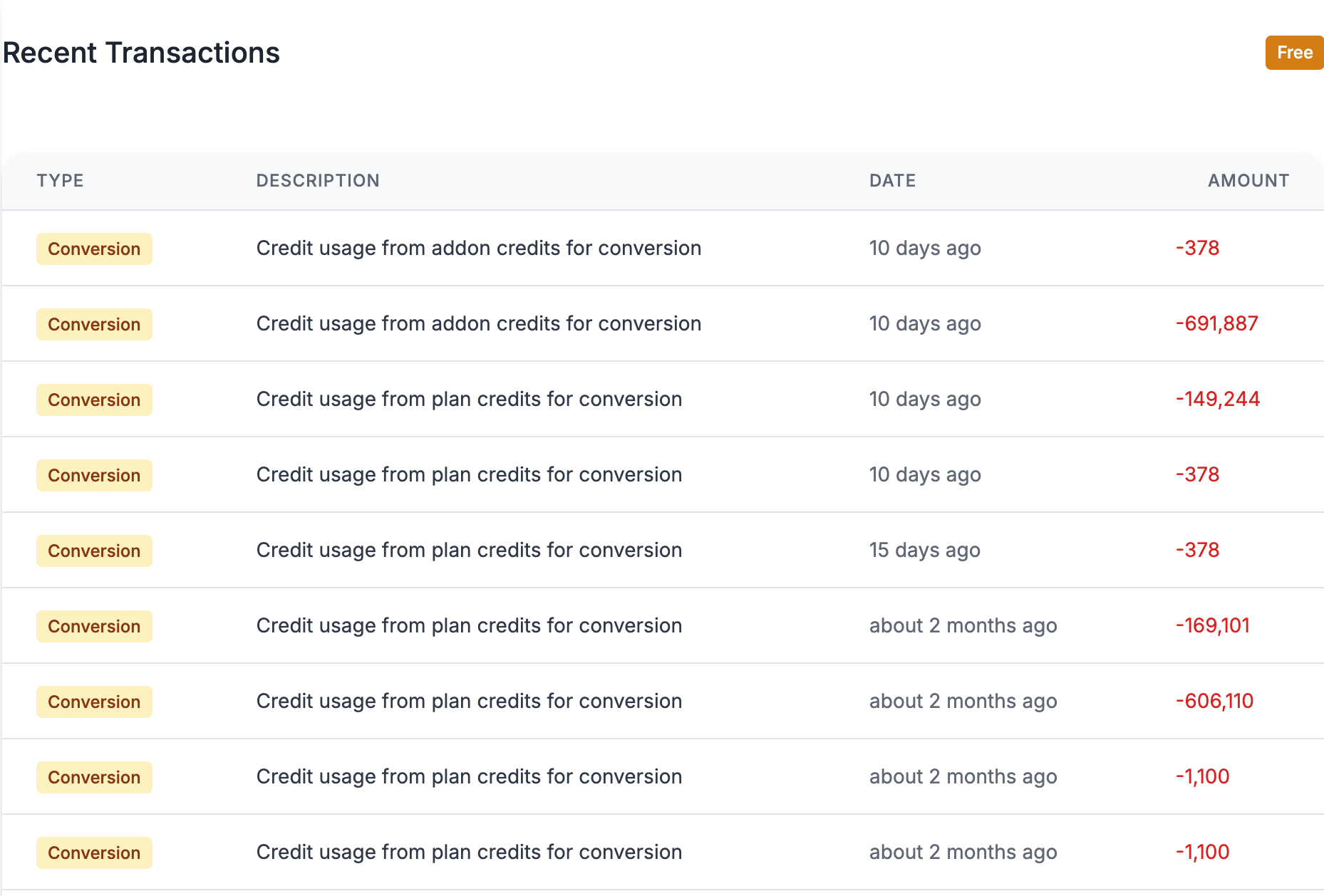
Credit Transactions
The detailed transaction history recognizes that users need to track their spending patterns and justify expenses, especially for business accounts. I designed this feature to show not just when credits were used, but what they were used for - which books, which narrator, what output format. This level of detail helps users optimize their future usage and provides the transparency needed for expense reporting and budget planning.
5. Mobile-First Responsive Design
Authors might work from anywhere: coffee shops, home offices, during commutes. That's why I prioritized mobile responsiveness from day one. The interface adapts seamlessly across all devices while maintaining full functionality. I didn't just shrink the desktop version; I reimagined each interaction for touch screens, ensuring that mobile users have an equally powerful, if not better, experience than desktop users.

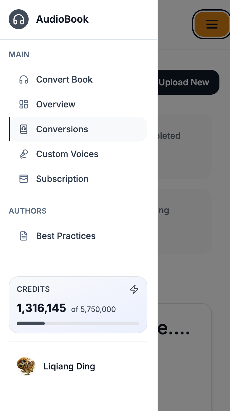
Figure 8: Mobile setup display
6. Role-based UI
I designed the interface with different user roles in mind, recognizing that audiobook production often involves teams. In a typical audiobook studio, editors need oversight capabilities while authors focus on their individual projects. That's why I implemented role-based access - editors and their associated authors can collaborate on the same books, while editors get additional administrative views to manage and review all conversions. This layered approach ensures everyone sees exactly what they need without unnecessary complexity.
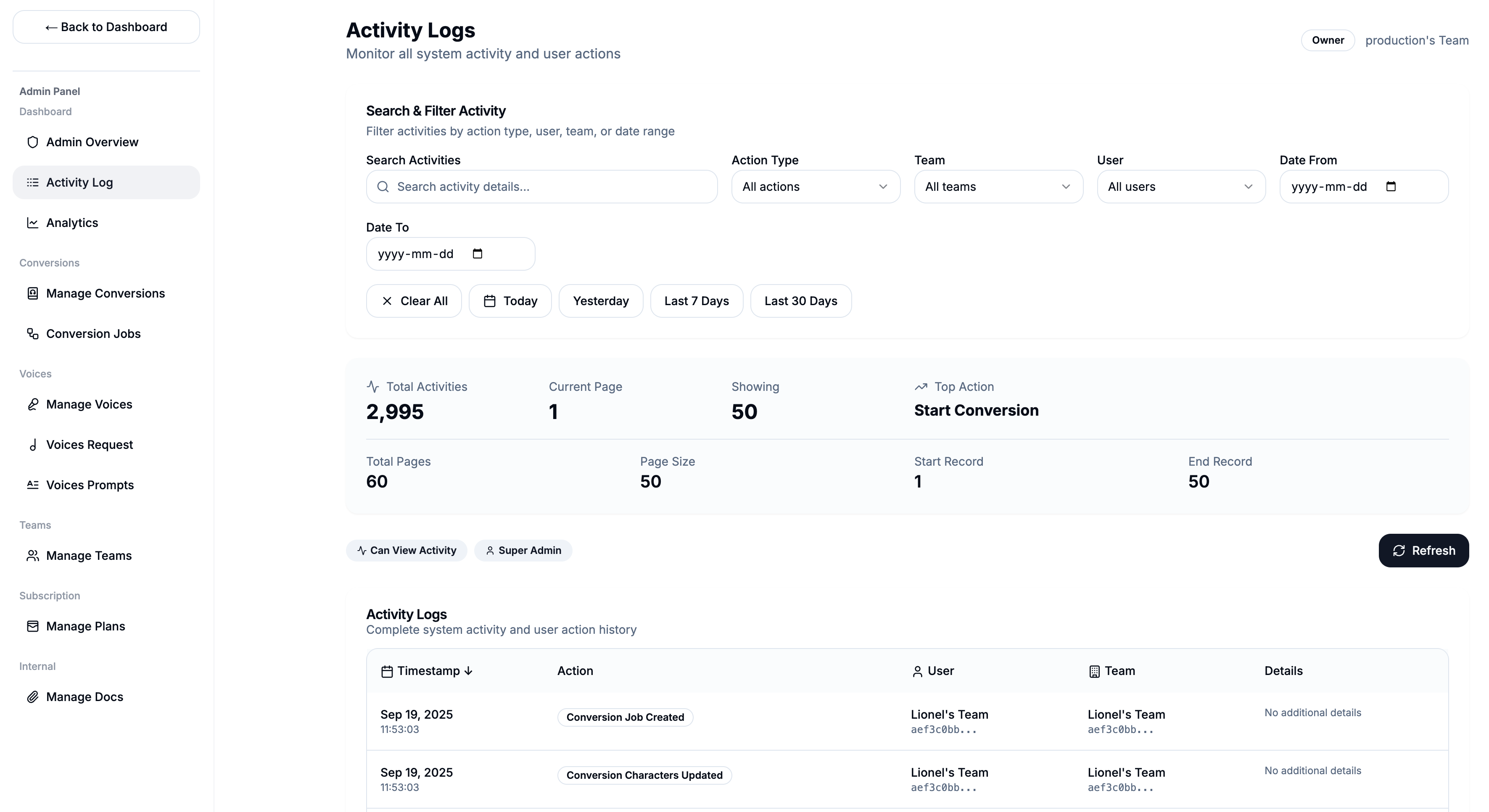
Figure 9: Admins see more options, regular users see simplified interface